


Modelling a pandemic: Time to Recover
Part 2 of a layman's guide to modelling a pandemic.
Introduction.
This is the second in a series of articles introducing the Susceptible-Infectious-Recovered (S-I-R) model. This class of models was used by various expert groups to explore transmission dynamics and help decision-makers during the early stages of the Covid pandemic, most notably those from Imperial College. For newcomers to my Substack, the first article of the series is available here.
The third article in the series can be accessed by clicking the following link.
The aim is to offer a guide for the layman, focusing on simplicity over technical complexity, hence any mathematics will be kept to a bare minimum. As in the first article, called ‘Going Viral’, I will provide links to on-line models for you to explore. Interacting with these models is a very good way to understand them, and I would encourage you to experiment with the simple models through the links provided.
Recap of “Going Viral”.
‘Going Viral’, the first article in this series on modelling a pandemic, focussed on the Susceptible-Infectious (S-I) component of the S-I-R model using a System Dynamics ‘Stock and Flow’ model. The logic of our simple S-I model, shown in the following diagram, was of a respiratory infection which, like Covid, spreads through close contact between individuals.

In this model individuals in the stock called Susceptible Population flow to the Infectious Population stock at the rate of Infections per Day. This rate is calculated using each of the five variables shown in the circles on the diagram. Importantly, the dynamics of the pandemic are determined by the balance between the reinforcing Contagion feedback loop and the balancing Depletion feedback loop.
At the start of a pandemic the chances of an infectious person contacting and infecting a susceptible individual are high which increases the number of infectious people who in turn infect more susceptible people. This reinforcing feedback loop accelerates the growth of the Infectious Population and, at this point, the Contagion Loop is dominant.
However, as the number of susceptible individuals decreases, the likelihood of infection drops until the Depletion Loop becomes dominant. Once this point is crossed, the daily rate of new infections falls and eventually stops when all susceptible individuals have been infected.
Joining all the DOTS
The first article introduced "DOTS" as a way of remembering the four key factors shaping a pandemic's trajectory1. The factors were the Duration of infection, Opportunity for transmission, Transmissibility, and population Susceptibility. The basic S-I model accounts for three of the four factors. So to complete our model, we now need to incorporate the Duration element by including the recovered individuals, thus forming a simple S-I-R model.
The following Stock and Flow diagram represents the structure of the simple S-I-R model of an infectious disease that now includes recovered individuals.

The diagram illustrates the addition of a 'Recovered Population' stock to the basic S-I model, which represents the count of individuals who have recovered from the infection. Importantly, recovered individuals have full immunity and are no longer susceptible.
In addition, a new flow called 'Recoveries per Day' has been introduced, indicating the rate at which people transition from the 'Infectious Population' stock to the 'Recovered Population' stock. Lastly, the 'Duration of Infection' variable has been incorporated which is used to calculate the Recoveries per Day flow rate.
The relationship between the Duration of an Infection and Recoveries per Day is relatively straightforward. Intuitively, if individuals are spending on average five days infected then one fifth of the Infectious Population will recover each day and move to the Recovered Population. This makes the calculation of the ‘Recoveries per Day’ rate simply a case of dividing the ‘Number Infectious’ by the ‘Duration of Infection’. Using this calculation does not means that people all recover at the same time, rather some people recover more rapidly and some more slowly. Note that the infection rate is formulated exactly as in the simple S-I model.
The Stock and Flow diagram also illustrates another key point in that we have now introduced a third feedback loop — the ‘Recovery Loop’ balancing feedback loop. This acts as a second brake on growth by removing individuals from the infectious population thereby reducing the Infections per Day rate.
Running the simple S-I-R model.
We are now ready to run the simple S-I-R simulation model. Once again our model has been created using a free on-line system dynamics modelling tool called InsightMaker, and the following image shows the screen interface.
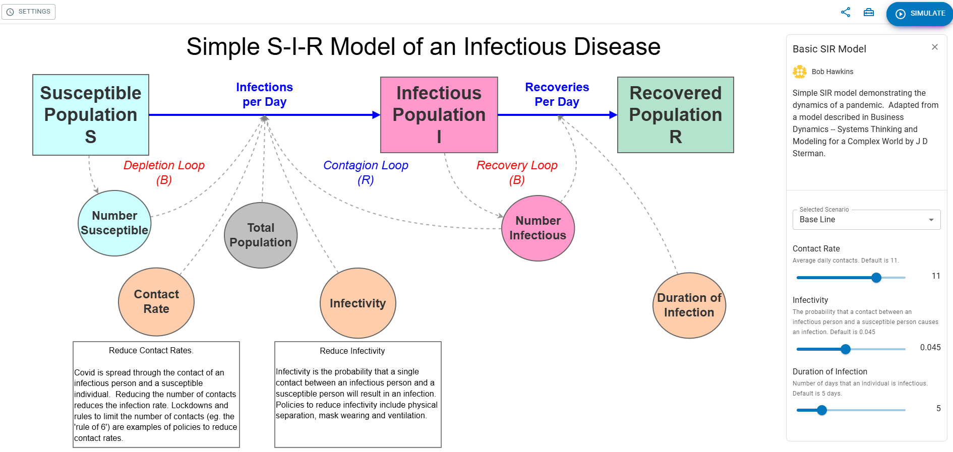
Although the interface is quite intuitive, a fuller description can be found in Appendix 1.
To run the simulation model using the default settings, simply click on the blue 'SIMULATE' button, found at the top right of the screen. A pop-up window will then display the results of the simulation run. In our case, we are interested in the the tabs showing the number of infections per day and the growth of the recovered population.
Before running the S-I-R model it is helpful to think about what will happen now we have introduced the duration of infection, set to a default of 5 days, and the recovery component. The default settings for the contact rate and infectivity remain identical to the simple S-I model, which previously showed a rapid increase in the daily infection rate, peaking at 12,355 infections per day after 23.5 days, followed by an equally swift decline. This resulted in the entire population of 100,000 becoming infected by day 50.
Take a moment to sketch out on paper your prediction of how you think the number of Infections per Day and the size of the Recovered Population will change over time now that we have added the recovery component.
Now you have run the model how did your prediction turn out? Did it follow the same broad trend as produced by the model?
Hopefully you have seen how incorporating a duration for the infection and the recovery period has altered the modelled behaviour of the pandemic over time. These changes have significant implications which are discussed in the following two sections.
Population Immunity
In the first article , we learnt that running the simple SI model resulted in all of the population being infected. However, for the SIR model not all of the population gets infected despite using the same values for the Contact Rate and Infectivity. After a about 100 days the pandemic stops and the recovered population is just about 89,000, well below the modelled population of 100,000. We have reached population immunity or, as it is more commonly called 'Herd’ immunity.
This raises the obvious question of why doesn’t everyone get infected?
Well it’s because of the balance between the reinforcing and balancing feedback loops that control the Infections per Day and Recoveries per Day rates. As a reminder the stock and flow diagram showing the feedback loops is given below.
In the early stages of an epidemic, the number of susceptible individuals is high, making the 'Depletion Loop' weaker compared to the 'Contagion Loop,' leading to a daily increase in infections. Consequently, the rate of new infections exceeds recoveries, causing the outbreak to expand. Over time, as the pool of susceptible people diminishes, the daily infection rate starts to decrease. When the daily infections equals the number of daily recoveries the epidemic starts to decline. The following figure represents the concept by displaying the recovery and infection rates over time from a simulation run of the basic S-I-R model with default settings.

The peak of an epidemic is reached when the recovery rate begins to surpass the infection rate. At this point, enough people have recovered and acquired immunity, and the number of susceptible individuals has fallen to a point where the outbreak cannot expand further. Consequently, the epidemic starts to decline. Eventually, while there are still individuals in the population susceptible to infection, but they are so few in number that an infected person is more likely to recover than meet one.
The following chart illustrates this by showing the change in the susceptible, infectious and recovered populations using the default settings of the simple S-I-R model.

In this scenario, the size of the recovered population stabilizes at approximately 89,000, which represents the level of herd immunity under these conditions.
The concept of herd immunity is a significant finding from the S-I-R model, as it allows for the control of infections without the need to vaccinate the entire population. However, there are other important insights which are discussed in the following section.
Why do some new diseases become pandemics?
Early scientists were baffled by the seemingly random outbreaks of infections they observed. There seemed to be no discernible pattern until the publication of the S-I-R model in the 1920s, which offered insights into the conditions necessary for the rapid outbreak of some diseases. The S-I-R model helps us understand the factors that make a new infectious disease likely to become a pandemic.
The simple S-I-R model tells us that for any given population of susceptible individuals, there is some critical combination of contact rate, infectivity, and disease duration that is just great enough for the reinforcing feedback loop to dominate the balancing loops. That threshold is a tipping point. Below this tipping point, the system remains stable, and should a disease be introduced into the community, there might be a few cases, but generally, individuals recover more quickly than new cases of infection arise. The balancing feedback dominates and the population is resistant to and epidemic.
Above the tipping point, the reinforcing feedback loop dominates. The system is unstable and once an infection arrives it can spread like wildfire through the reinforcing feedback and is only limited by the depletion of the susceptible population.
To illustrate the tipping point, the following chart shows the recovered population of several simulation runs of the simple S-I-R model using different contact rates. The default values for the infectivity and duration of infection are unchanged.
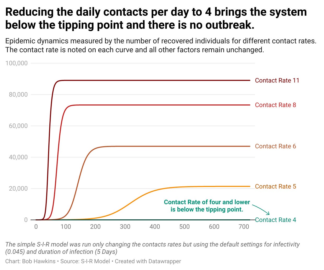
The chart indicates that an epidemic does not occur when the contact rate is below four persons per day. However, once the contact rate exceeds the critical threshold of four per day, the system becomes unstable, leading to an epidemic. As the contact rate increases, the reinforcing contagion loop intensifies compared to the balancing loops, accelerating the progression of the epidemic. Furthermore, the more the contagion loop dominates the greater the number of people who catch the infection and subsequently recover.
Finally, it is notable that the closer you approach the threshold then small changes to the contact rate can have large effects. This explains why it is difficult to predict if the introduction of a new infectious disease in to a community will cause an epidemic. In the jargon of complexity the system is ‘STIC’ - Sensitive To Initial Conditions.
Any change increasing the dominance of the contagion loop will have similar results. An increase in infectivity strengthens the contagion loop and is identical in impact to an increase in the contact rate. An increase in the duration of infectiousness weakens the balancing recovery loop and also pushes the system further past the tipping point resulting in the conditions for an epidemic.
Try using the simple S-I-R model to find the threshold for the Duration of Infection that results in the conditions when the introduction of a new infectious disease would not result in an epidemic.
In conclusion.
This article demonstrates that by completing the simple S-I-R model, the dynamics of an epidemic are altered, leading to the important finding that population immunity, or 'herd' immunity, can halt an outbreak before it infects all susceptible individuals.
Furthermore, the simple model provides key insights into the factors that contribute to the conditions leading to an epidemic, explaining why things spread and why they don’t.
I hope that you have found this article of interest and feel free to ask any questions or leave your comments below.
The next article will examine additional factors influencing the spread of new infectious diseases and can be found here.
Appendix 1. Overview of the InsightMaker Interface
This section describes in more detail the InsightMaker screen interface using the simple S-I model as an example. The following image shows the landing page for the model. Click on the image and select full width from the … menu to view the detail.

The screen features three sections outlined in red. The main portion of the screen presents a diagram depicting the model's logic as a stock and flow diagram. The two boxes are the susceptible and infectious population stocks, linked by a flow, indicated by a blue arrow, labelled 'Infections per Day'. The circles represent the variables of the model that determine the 'Infections per Day' rate.
The right-hand panel has a dual function. The default setting, shown in the image above, displays information about the model and allows the user to adjust the Contact Rate or Infectivity using sliders. Its secondary function is to allow the user to examine the model's logic in more detail. By selecting any of the stocks, flow rates, or variables, the panel shifts to present comprehensive information about the chosen building block. To revert to the default display, click anywhere on the main portion of the screen that is not a building block.
Finally, the area along the top of the screen allows the user to change the length of the simulation run and, most importantly, run the model by pressing the blue ‘SIMULATE’ button.
The simple S-I model can be run from a PC or Mac and then pressing the ‘SIMULATE’ button. A pop-up window will appear with a number of tabs that show graphically how the output from the model changes over time.
The DOTS acronym comes from Adam Kucharski’s excellent book - The rules of Contagion: Why Things Spread and Why they Stop.