


Modelling a pandemic: Going Viral
A layman's guide to modelling a pandemic - Part 1

Introduction.
This is the first in a series of articles describing the basic workings of one type of model used to help make policies during the Covid pandemic. The aim is to offer a guide for the layman, focusing on simplicity over technical complexity, hence any mathematics will be kept to a bare minimum.
Most disease modellers use Susceptible-Infectious-Recovered (S-I-R) models to understand the spread of disease through a population. In its most basic form this model assumes that people in a population are either susceptible to the disease (S), infected with the disease (I) or recovered (R) from the disease. Mathematical equations describe how people move between being susceptible, infected or recovered. These equations depend on the infection rate for the disease and also the recovery rate.
As we progress through the articles we will see how the S-I-R model can be used to simulate an epidemic on a computer. At each stage I will provide links to simple on-line models that you can ‘play’ with to explore and learn about the ‘viral’ dynamics of an epidemic of an infectious disease like Covid.
The second article in the series can be accessed by clicking the following link.
I believe that interacting with these models is the best way to understanding them, and would encourage you to experiment with the simple models through the links provided.
Learning from games
Beginning an article on ‘how to model a pandemic’ with a section on learning from games might appear unusual, yet it serves as a way to introduce the concept of simulation models, sometimes referred to as 'serious games'.
Games are valuable learning tools because they provide an engaging and interactive method for developing new skills and knowledge. For instance, children playing with LEGO bricks develop spatial reasoning, creativity, and fine motor skills. Similarly, card game enthusiasts enhance cognitive and analytical abilities by assessing risks, interpreting opponents' actions, and making decisions under pressure.
In many fields, learning about complex processes through direct interaction with the real world is too expensive, time-consuming, or even not possible. Simulation models can be used as an effective and efficient alternative. Engineers learn about the aerodynamics of new vehicles using computer models before building physical prototypes; pilots train on simulators before taking to the skies; and armies use wargames, both physical and computer-based, to prepare for combat.
Each of these is an example of a ‘serious game’ where learning about the real world occurs by interacting with a model that is already built. The model provides a safe environment to test out novel designs, train people to handle new challenges, or evaluate different policies.
However, in areas like policy making, there is often greater learning to be gained from the steps taken to build a model. Building a model surfaces the different mental models policymakers will naturally hold—essentially their individual understandings and assumptions about how the system works. As these mental models are articulated and mapped out, everyone can compare their views, challenge each other's assumptions, and see where they differ. This helps make implicit assumptions explicit and opens the door for discussion, reconciliation and consensus.
Later we will see that visual representations of simulation models are among the most effective way to convey the model's logic and results, making it easier to follow the logic and any assumptions made. Frequently, the logic behind models is obscured by intricate equations, making them difficult to understand and trust. Indeed, as the adage goes, 'a picture is worth a thousand words,' which holds true for simulation models as well.
In summary, through building a model policymakers can gain a deeper understanding of the system they are trying to influence, clarify the assumptions and boundaries within which they are working, and help learn where their interventions are likely to be most effective. Done well, this learning is foundational for making informed, effective policy decisions which can be tested out on the completed model.
The basic S-I-R framework.
The aim of infectious disease modelling is to understand the routes and mechanisms that drive the spread of infections so that we can ultimately design interventions to prevent or manage them.
The most widely used framework for projecting the long-term course of an epidemic are compartmental models. The simplest form of this framework, depicted in the diagram below, is the S-I-R model. The initials S, I, and R stand for the Susceptible, Infectious, and Recovered (or sometimes Removed) compartments of a population.

At the onset of an epidemic, the entire population is vulnerable to the disease. With the emergence of an infectious pathogen, such as Covid, individuals contract the illness and become contagious. These infectious individuals eventually recover after a certain period and move to the recovered group. The infection rate controls how many people shift from being susceptible to infectious, while the recovery rate determines how quickly people move from infectious to recovered.
All models make assumptions and it’s important that these are made clear. In this case the basic framework is based on several simplifying assumptions which include:
All individuals in the population behave in the same way;
The recovered population has full immunity, with no waning of immunity;
At the onset of the epidemic, the entire population is susceptible, lacking immunity from either vaccines or previous exposure;
Individuals become immediately infectious, as there is no 'exposed' phase before they are infectious; and
There are no births, hospital admissions, or deaths.
It goes without saying that the models created to tackle policy issues concerning Covid were significantly more advanced and addressed many of these assumptions. For instance, the population was divided into various groups exhibiting distinct mixing patterns, typically based on age.
From framework to model.
So far, we have only looked at the S-I-R framework, a static model that does not offer insights into how an epidemic progresses over time. To analyse the dynamics of an epidemic it is necessary to transform the framework into a computer model. This can be a complex process involving solving multiple differential equations. Fortunately for us this can be simplified through the use of System Dynamics modelling.
System Dynamics modelling uses diagrams and simple equations to show how different parts of a system, like a virus and a population, interact with each other. The rest of this section summarises the key concepts of System Dynamics modelling.
System Dynamics models are based on the important concept of feedback which capture the dynamic behaviour of the system—how actions and reactions interplay over time. There are only two types of feedback loops: reinforcing loops and balancing loops, each with distinct characteristics and effects within any system. The following diagram illustrates the two types of feedback.
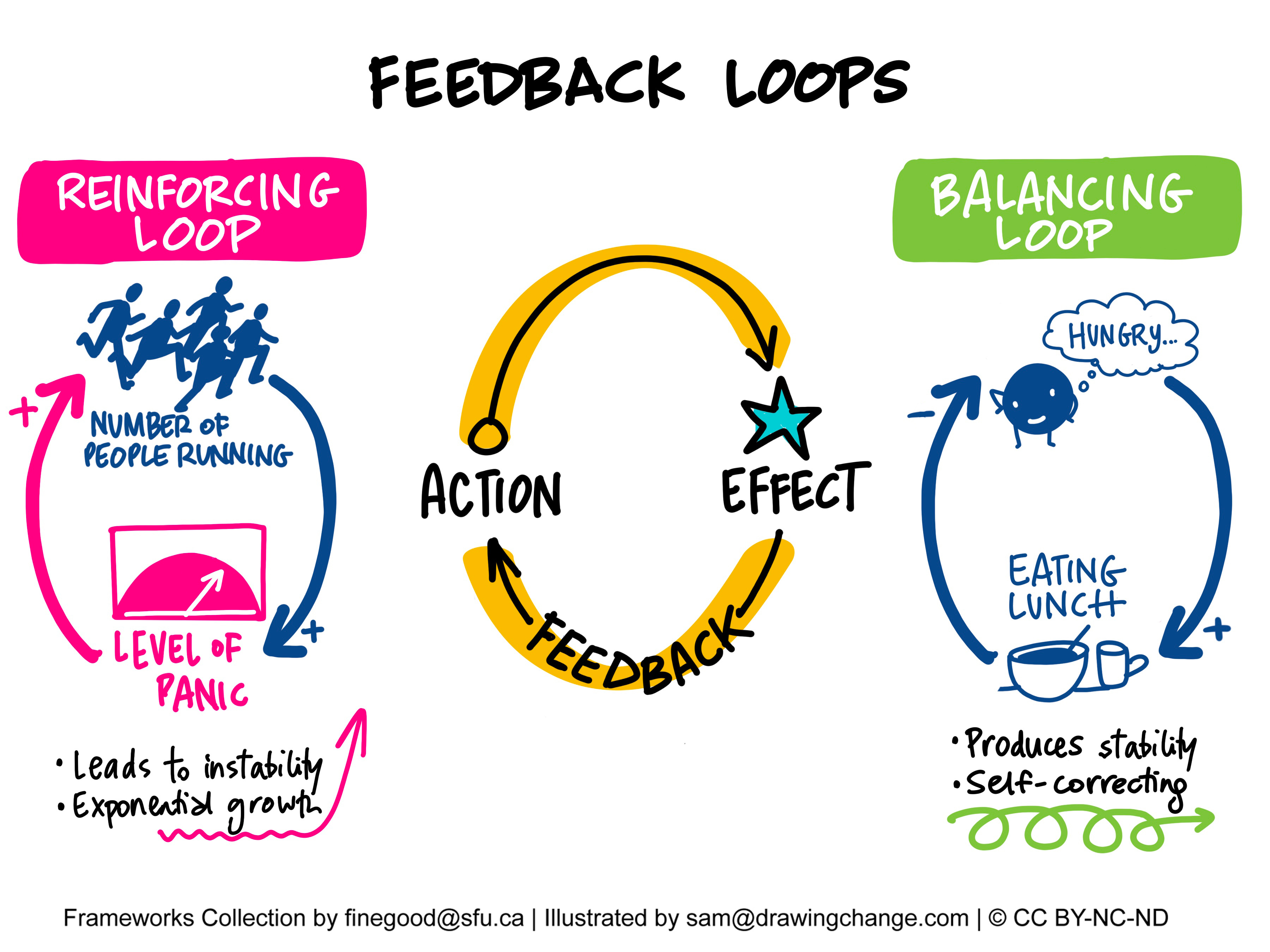
Reinforcing Loops amplify changes within a system, leading to exponential growth or decline and causing instability if not controlled. This type of loop can result in rapid escalation or runaway behaviour. In the image, an increase in the "number of people running" raises the "level of panic," which in turn causes more people to run, creating a cycle that escalates rapidly. Such loops can be beneficial in contexts like economic growth or viral marketing but are detrimental in situations like the spread of disease.
Balancing Loops counteract changes, promoting stability and equilibrium within a system. They work to bring the system back to a desired state or set point, acting as a self-correcting mechanism. In the image, feeling "hungry" leads to "eating lunch," which reduces hunger and thus decreases the drive to eat more, maintaining balance. These loops are essential for systems to remain stable, such as supply and demand in economics, or the thermostat-regulated temperature control in your house.
To complete our simple model we need to introduce two further System Dynamics concepts and these are Stocks and Flows. These help describe how things accumulate or change over time within a system.
Stocks: Stocks are the "containers" that hold resources or quantities in a system. They represent the stuff that can accumulate or deplete over time, like water in a tank or money in a bank account. Stocks are the things you can measure at any given moment. In our simple model the number of people in the susceptible and infectious populations are stocks.
Flows: Flows are the "pipes" that fill or empty the stocks. They represent the rates at which things enter or leave the stocks. Flows are the actions or processes that cause changes in the stock over time. In our example, the infection rate depletes the stock of susceptible people and adds to the infectious population stock.
Modelling Infections
We are now in a position to model the infection step of the S-I-R framework using the System Dynamics concepts outlined in the previous section. To develop our first model we start by drawing a stock and flow diagram of the infection process. For this first model we will only cover the S-I part of the framework and will add the recovery component in the next article.
The diagram below represents the Systems Dynamic model of the infection rate for respiratory viruses such as Covid, highlighting the stocks and flows together with the depletion (balancing) and contagion (reinforcing) feedback loops involved.
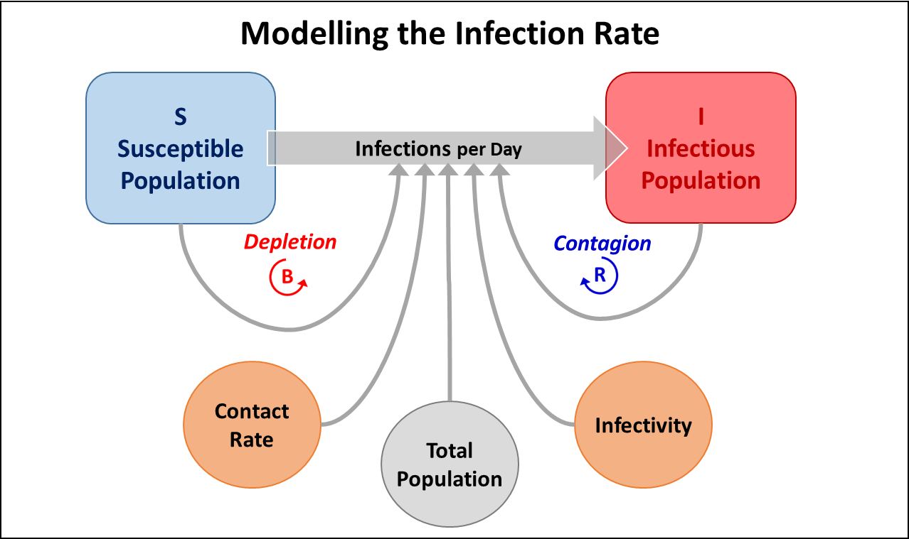
The key element that determines the dynamics of a pandemic is the infection rate (shown as Infections per Day) between the stocks representing the Susceptible and Infectious Populations. The factors influencing the infection rate stem from the virus's mode of transmission, which differs with each disease. In the case of respiratory diseases, like Covid, this occurs mainly through individuals being in contact with each other which is represented in the diagram by the contact rate.
The following diagram illustrates how the infection rate is calculated for a respiratory virus in this simple model.
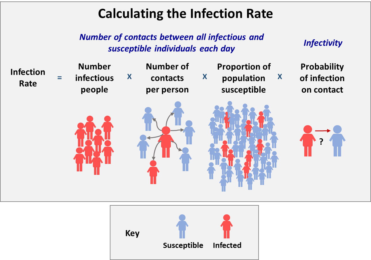
In simple terms, the infection rate is the total number of daily contacts between infectious individuals, shown in red, and those remaining susceptible to infection, multiplied by the probability that a contact will lead to a new infection (infectivity).
Taking the diagram as an example we can see that there are eight infectious individuals with each making an average of six contacts per day, resulting in a total of 48 individual contacts daily. However, not all contacts are with susceptible individuals, so to calculate the daily number of contacts with susceptible individuals, we multiply the total number of individual contacts by the proportion of the population that is susceptible. In the diagram, there are 40 susceptible individuals in a total population of 48, which means the proportion of susceptible individuals is 40/48. Completing the calculation gives 40 contacts per day between infectious and susceptible individuals.
Not every encounter between a susceptible person and an infectious individual results in transmission. Infectivity is the likelihood that a susceptible person will contract the infection after a single exposure through contact with an infectious individual. This probability, which is a characteristic of the virus, its environment and the individuals involved, varies from zero to one. Infectivity is set to one when every contact between an infectious and a susceptible person causes infection. If no contacts lead to infection, infectivity is zero.
We can now take the final step to calculate the Infections per Day rate. For our example, let's assume the infectivity rate is 0.05, meaning there is a 5% chance that contact between an infectious individual and a susceptible person will lead to an infection. Simply multiplying the total number of daily contacts between infectious individuals and those susceptible to infection (40) by infectivity (0.05) gives an infection rate of 2 per day. It’s important to note that the next day the infection rate will change because the number of susceptible individuals will reduce by two and the infectious population stock will increase by two.
Running the S-I Model
We now have all the components to build and run our first model. The model has been created using a free on-line system dynamics modelling tool called InsightMaker and the following image shows the screen interface for the basic S-I model. This basic S-I model simulates the progress of a respiratory virus through a population of 100,000 people over a period of 180 days. The model starts with the introduction of one infectious person on day 1.
Click on the image and select full width from the … menu to view the screen detail.

The screen features three sections outlined in red. The main portion of the screen presents a diagram depicting the model's logic as a stock and flow diagram. The two boxes are the susceptible and infectious population stocks, linked by a flow, indicated by a blue arrow, labelled 'Infections per Day'. The circles represent the variables of the model that determine the 'Infections per Day' rate.
The right-hand panel has a dual function. The default setting, shown in the image above, displays information about the model and allows the user to adjust the Contact Rate or Infectivity using sliders. Its secondary function is to allow the user to examine the model's logic in more detail. By selecting any of the stocks, flow rates, or variables, the panel shifts to present comprehensive information about the chosen building block. To revert to the default display, click anywhere on the main portion of the screen that is not a building block.
Finally, the area along the top of the screen allows the user to change the length of the simulation run and, most importantly, run the model by pressing the blue ‘SIMULATE’ button.
The simple S-I model can be run from a PC or Mac by clicking the following link and then pressing the ‘SIMULATE’ button. A pop-up window will appear that shows graphically how the output from the model changes over time. In our case, we are interested in the number of infections per day and the growth of the infectious population.
Before running the model, take a moment to sketch out on paper your prediction of how you think the size of the Infectious Population and the number of Infections per Day will change over time.
Now you have run the model how did your prediction turn out? Did it follow the same broad trend as produced by the model?
So far we have run the model using the default settings for the Contact Rate and Infectivity, but it is easy to change these settings using the sliders in the right hand panel. When the 'sliders linked' text is showing then the impact of changing contact rates or infectivity using the sliders is immediately shown on the graphs. If the ‘sliders linked’ text is not showing then run the model again by clicking the SIMULATE button and a new pop-up window will appear.
Now try reducing the Contact Rate and/or Infectivity to see what happens to the progress of the epidemic. In particular, what happened to the number of infections per day over time?
Exponential growth and tipping points
By now you will have gained some experience of the behaviour of this simple model overtime and will recognise that the graph for infections per day followed the same broad trend we saw for Covid cases at the start of the pandemic.
But what is it that drives this behaviour? Well the answer lies in the interaction between the two feedback loops.
As you will have seen, the number of daily infections starts small and grows slowly before rising faster and faster. The driving force behind this exponential growth can be found in the ‘Contagion’ loop shown to the right of the S-I stock and flow diagram. The ‘Contagion’ loop is a reinforcing feedback loop, marked with the blue letter 'R' in a circular arrow, signifying its role in accelerating the spread of the disease. As the number of infectious individuals increases, the daily infection rate also rises, leading to a greater number of infectious individuals and fuelling an exponential growth.

However, nothing can grow forever and the same is true for epidemics. After a while the number of daily infections starts slowing down and the falls. This is due to the ‘Depletion’ loop shown on the left of the diagram. This is a balancing feedback loop, indicated by the red letter 'B' in a circular arrow, which acts as a 'brake’ on growth. As the pool of susceptible individuals dwindles, the daily infection rate falls, ultimately reaching zero when the virus exhausts the population to infect.
The dynamics of infection growth are determined by the changing balance between the reinforcing and balancing feedback loops. Initially, the reinforcing ‘Contagion’ loop dominates, leading to an exponential increase in disease cases. However, this rapid rise reduces the pool of susceptible individuals, which strengthens the balancing ‘Depletion’ loop. Eventually, a tipping point is reached where the balancing loop overpowers the reinforcing loop, resulting in a decline in the daily number of infections. The tipping point is marked by the peak in daily infections on the infections per day graph.
The panel chart below demonstrates this dynamic based on a typical simulation of an S-I model for an infectious disease. In this scenario, the tipping point is reached just after 42 days, at which time 50% of the total population has become infectious.
Joining the DOTS
In his insightful book, "The Rules of Contagion", Adam Kucharski gives a valuable way to recall the main factors influencing the rate at which an infectious disease spreads or declines. He writes that there are four key factors and calls them the “DOTS” for short and they are:
The Duration of the time someone is infectious;
The Opportunities someone has to spread the infection each day they are infectious;
The probability an opportunity results in a Transmission; and
The average Susceptibility of the population.
Breaking down infection dynamics into these “DOTS” components helps us understand how the different aspects of transmission trade-off against each other. This can help us to work out the best way to control an epidemic. For instance, with a respiratory virus such as COVID-19, restricting the size of gatherings can reduce Opportunity; employing masks or maintaining physical distance can lower Transmission, and immunity gained from infection or, if accessible, vaccination can decrease Susceptibility.
In our simple S-I model, we have have addressed just three of the “DOTS” components so far. The Opportunities someone has to spread the infection each day they are infectious is covered by the Contact Rate. The probability an opportunity results in a Transmission by the Infectivity variable, and the average Susceptibility of the population is represented by the relative size of the Susceptible Population.
To compete the model and join the “DOTS” we need to include the Duration of the time someone is infectious and recovers to our simple S-I model. This will be the topic of next weeks article where we will complete the S-I-R model and explore how this changes the pandemics dynamics in a surprising way,
Conclusion
I hope that you have found this first article introducing a simple model an infectious disease interesting and if you have any questions then please ask them in the comments section below.
For those who want to explore how this type of model can be used in other areas then you can explore the next section.
Finally, the next article in this series covering the Recovery stage can be found here.
Addendum: Going viral in other areas
A useful feature of simulation models is that they can often be easily adapted to help in different areas, and the simple S-I model is no exception. The concept of positive feedback as a driver of adoption and diffusion is very general and can apply in many domains. For instance, a rumour proliferates when individuals who know it share it with those who don't, who then pass it on further. Similarly, early buyers of a new product introduce it to their friends and family, some of whom are convinced to make a purchase, thereby exposing even more potential buyers to the product.
As an example, the following chart plots the number of mobile phone subscriptions per 100,000 people between 1980 to 2022 for the UK and globally. The chart is remarkably similar to the progress seen in our S-I model of an infectious disease.

The following link is to a simple model of the market growth for mobile phone sales based on the same logic used for the S-I model. Feel free to click on the link to explore the model in more detail.
Excellent introduction - thank you!
Really looking forward to the rest of the series.
This is really helpful. I read an article shared by Dr Ki Yates this morning; although really interesting as a non-scientist and -mathematician I struggled with certain explanations. This piece has clarified a number of points, thank you.