

Covid Lockdowns - A tour of England's Regions
Covid Lockdowns - A tour of England's Regions
A deep-dive into the impact of the Autumn 2020 lockdown on deaths across England's nine regions. A story of regional differences and what we can learn from them.

Summary.
This is the second of three articles looking at the impact of lockdown measures implemented in the UK during the period October 2020 to May 2021. A period where the UK home nations saw two separate period of lockdowns.
The aim of these articles is twofold. First does the data tell us anything about the impact these lockdowns had on deaths in the period after they were implemented. And secondly, can we learn anything about the importance of the timing and duration of lockdowns
This second article looks at the impact of the Autumn lockdown implemented from Nov 5 to Dec 2, 2020 on the English regions. It tells a story of how regional differences before and after the lockdown changed the impact on deaths. The article also shows that early signs of a new more infectious variable were visible in November 2020.
A Recap
Lockdowns are a measure of last resort. The impact on society and the economy are huge and best avoided through other measures. In the absence of a vaccine, effective contact tracing with isolation of infectious individuals together with other measures like social distancing offer a far better approach. Unfortunately, these measures are sometimes insufficient and lockdowns are implemented.
In the previous article we looked at how Wales’s ‘circuit breaker’ and England’s Autumn lockdowns slowed the rate of death and undoubtable saved lives. However, at the national level they only succeeded in stabilising the death rate for a relatively short time before it continued to increase.
A history of regional difference
On Oct 6, Westminster had introduced a three tier ‘COVID alert levels’ system to clarify regional restrictions for England. These were the ‘medium’, ‘high’, and ‘very high’ tiers which aimed to progressively reduce the level of physical contacts by limiting the opportunities to mix socially.
Tier 1 had the fewest restrictions, groups of up to 6 people were allowed to meet indoors or outdoors. In Tier 2, people were prohibited from mixing inside with individuals outside of their households, were only allowed to meet with up to 6 people outdoors, and pubs and restaurants had to close between 10pm and 5am. In Tier 3, people were additionally prohibited from meeting with people outside their household in private gardens. For all tier levels schools and universities remained open and there was no firm guidance on working from home.
Local areas were assigned to tiers based on the average rate of change in case numbers and pressure on the health service across their area, although there was an element of ‘political pressure’ applied when areas were being moved up a level.
By late October 2020 the news was full of interviews with leaders from Liverpool and Manchester whose areas were suffering from high rates of Covid infections and had been placed in the very highest level of restrictions. Their message often was ‘why are we being treated differently from other regions and where is the financial support we need’. Clearly there were large regional differences but what were they? Well the following maps show the tier levels at the local authority level immediately before and after the Autumn lockdown.

As you can see the regional differences before lockdown are stark with the ‘very high’ Tier 3 level only implemented in the north of England and particularly the North West region. Other areas in the north were also in the ‘high’ Tier 2 level together with London and parts of the East of England. All other areas were assigned to the lowest ‘medium’ Tier 1.
The map on the right shows the tier levels after lockdown and it’s clear that significant regional differences remained. Again the northern regions have the most areas in the ‘very high’ Tier 3 level together with a few areas in the South East and South West regions. The rest of the country entered the ‘high’ Tier 2 level apart from Cornwall and the Isle of Wight in the South West region.
These maps tell us that to fully understand the impact of England’s lockdown we need to look at the regional level. As the north, particularly the North West region, had the highest level of mitigations before and after the lockdowns let’s start our tour there. It’s a bit of a long journey but I think that it’s worth it.
A northern tour
The following chart shows the death rate for the three regions in the north of England. They are the North East (in blue), North West (in green), and Yorkshire and Humberside (in brown) regions. The two diamond markers indicate the number of days since the start of the lockdown which is when we would expect to see any impact on the death rate. This is because on average deaths occur between 15 to 23 days after infection. Finally, the annotated markers show when major areas entered Tier 3 .
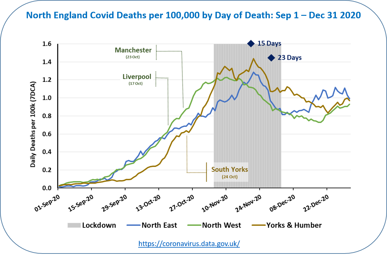
Although each region enters lockdown with a relatively high rate which then falls this chart tells an interesting story with each region following a different path.
The North West region (in green) is a clear outlier with the death rate starting to slow before lockdown starts. It also plateaus 6 days after the start of the lockdown which is well before the earliest time we would expect to see an impact.
What could explain this behaviour? Well we saw earlier that almost all areas in the North West were in the very highest tier at the start of lockdown with the two largest cities in the region entering Tier 3 on Oct 17 and Oct 23. The early slowdown in deaths would strongly indicate that Tier 3 was having an impact ahead of lockdown. However, it is not clear that this would have been sufficient as the death rate only started to decline significantly after two weeks from the start of lockdown. This is exactly when we would expect to see an impact. Interestingly, the North West is the only English region to come out of lockdown with a lower death rate than it entered with. This suggests an earlier lock down would have helped the other regions.
The Yorkshire and Humberside region (in brown) shows a different path. It has the fastest increase in deaths heading in to lockdown and peaks 6 days after the start of the lockdown before increasing to another peak 15 days after lockdown started. From this time onwards the death rate drops as we would expect.
Explaining this behaviour is a bit more complex but again we need to look at when tiers were implemented in the Yorkshire and Humberside region. The chart shows that South Yorkshire entered Tier 3 on Oct 24. This would mean deaths in South Yorkshire slowed down earlier than the rest of the region causing the first peak 6 days after the start of lockdown. As the rest of Yorkshire and Humberside region did not see the benefit of Tier 3 restrictions deaths continued to rise until the impact of the lockdown started 15 days from the start of lockdown. Again the death rate only started to rapidly decline two weeks after lockdown indicating it was the lockdown having the most impact.
Finally, in our tour of the North, we turn to the North East region (in blue) which shows a simpler path entirely consistent with what we expect from the impact of a lockdown. The death rate for this region continues to rise after the start of lockdown and only starts to fall 15 days after the start of lockdown. Unsurprisingly, the North East did not have any areas in Tier 3 prior to lockdown.
Let’s finish our story after the end of lockdown. Here all three regions in the north continued to have declining death rates for a few weeks. As we will see shortly this was not the case for any of the other regions and is most likely because the Northern regions had the highest number of areas in Tier 3 level post lockdown.
In summary, the North East provides an interesting ‘natural experiment and shows that the Tier 3 levels implemented ahead of lockdown had a positive effect on the impact of the lockdown and reduced deaths.
Tales from Middle England
The next three regions to look at are loosely in the middle of England and comprise the East Midlands, South West and the West Midlands. The following chart shows the death rate for each of these regions together with the key lockdown dates.

Here the story is different but much simpler than we saw previously. All regions saw death rates increasing until they peaked 15 to 23 days after the start of lockdown before slightly decreasing. Unlike the northern regions there was no decrease in death rates after the lockdown ended.
The East Midlands was the only region that had any areas entering Tier 3 prior to lockdown when Nottingham was placed in Tier 3 on Oct 30. This was just 6 days before the start of lockdown and was too late to have any real impact. Following lockdown several areas in these regions were placed in tier 3 but not as extensively as in the northern regions.
In summary, whilst the lockdown did stop the increase in the death rate we do not see the sustained decrease shown in the north. This is most likely explained by the lower levels of mitigations in place both before and after lockdown.
Southern Alarm Bells
Let’s close our tour of the English regions by now looking at the worrying story of the south. The southern regions comprise the East of England, London, and the South East and are shown on the following chart together with the key lockdown dates.

These three regions in the South of England show a remarkably different and alarming path compared to all others. They all entered lockdown with relatively low death rates that were growing slowly but the lockdown did not slow the growth and shortly after exit from lockdown we see a very rapid rise in deaths. This is despite many areas in the South entering the highest level of Tier 3 at or days after lockdown ended.
What could possibly have caused this? Well we now know that a new variant had arrived on the scene and it was a game changer. First labelled the Kent variant, later designated B.1.1.7, and now most commonly called the Alpha variant. Alpha was much more transmissible than the Wuhan strain which it rapidly displaced.
The Alpha variant probably first arose in September 2020 in the South East region. This means that it was certainly in circulation in the South of England before lockdown started on Nov 5. With that in mind we can see that the lockdown as implemented may have slowed growth of the Alpha variant but did not reverse its’ growth. Indeed a paper analysing epidemiological and genetic data published Jan 4, 2021 noted that ….
“Critically, we find evidence that non-pharmaceutical interventions (NPIs) were sufficient to control non-VOC lineages to reproduction numbers below 1 during the November 2020 lockdown in England, but that at the same time the NPIs were insufficient to control the VOC (Alpha variant).”
The story of the Alpha wave and the third Winter lockdown is for another day which I will cover in my final article in this series. Ironically, by partially suppressing the Alpha variant the November lockdown could have allowed the variant to spread undetected making the surge seen post-lockdown more widespread.
What lessons can we learn?
Well first we’ve seen that looking at the data by region provides a much more nuanced picture than looking at England as a whole. Each region has a different history leading up to the lockdown and different actions were taken on lockdown exit. In the north, lockdowns together with stricter restrictions before and after entry certainly slowed and reversed the death rate. For middle England, which had less strict restrictions before and after lockdown, the death rate was slowed but did not come down. In the South, the Autumn lockdown did not slow down deaths and was not sufficient to control the growth of the new Alpha variant.
In short, local context matters and interpreting data at the national level means that at best you may miss important messages, and at worst can be misled.
Secondly, could a comparison of regional deaths data have been used as an early indicator of the alpha wave? Here we have to accept that hindsight is a wonderful thing and I think that the answer is probably no. We have to remember that deaths are a lagging indicator only are telling us something about what happened a few weeks ago. Also there are significant reporting delays. Registration of deaths takes about 5 days and it can take up to 11 days before the deaths data is reliable.
‘Nowcasting’ techniques were used to overcome the reporting delays by estimating the ‘missing’ Covid deaths based on what happened in the past. Perhaps these ‘Nowcasting’ estimates of deaths could have picked up the trends shown with the actual data. If that was the case then deaths could be a useful early warning of the changing nature of a pandemic and supported the case for further interventions.
A final note.
If you have made it this far on this long journey then thanks. I hope that I have done this story justice but I would appreciate any feedback on the article – both positive and negative. Your comments are most welcome.